

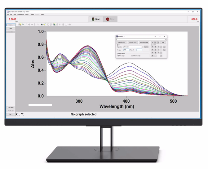
Cary WinUV software and its many data plotting tools
In the first part of this series, we looked at some straightforward hardware approaches for extra spectral fidelity in routine analyses from the incredibly versatile Cary 60 UV-Vis spectrophotometer. Having now acquired data, let’s break down some easy methods of brightening our spectra right in the Cary WinUV software itself, thereby eliminating the need to export and replot data in external software. From fonts, plot styles and colors to annotations, pictures, and more, Cary WinUV has a suite of formatting options to make any data look its best onscreen.
Formatting data plots in Cary WinUV
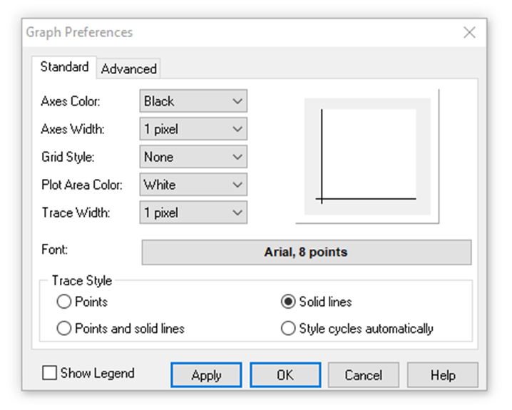
The first task is to ensure that all the basic elements of dataplots look ready for presentation. Right-clicking on any dataplot in Cary WinUV and selecting “Graph Preferences” will display the following window, which includes options to set various fonts, sizes, styles, gridlines and colors of the currently selected dataplot.
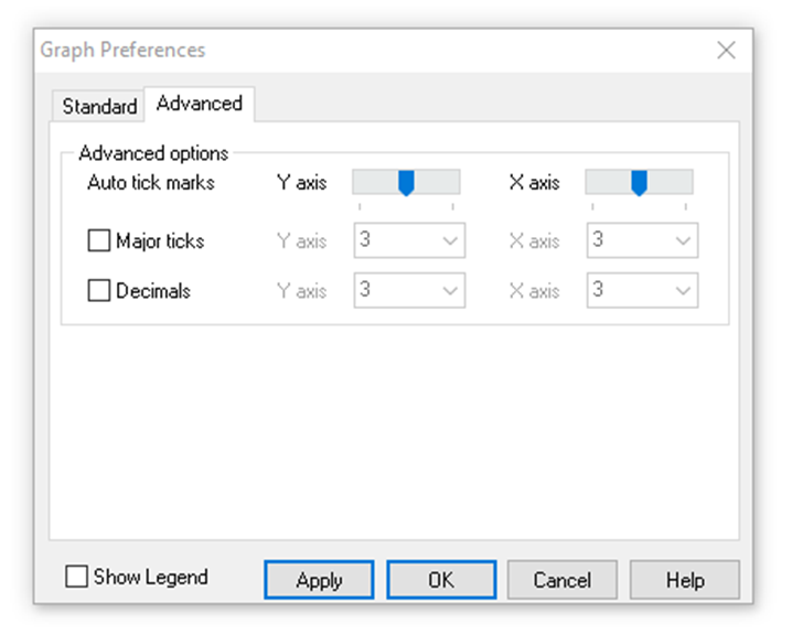
Navigating to the Advanced tab of this window reveals settings for “major ticks” (numerical degredations) along both axes as well as their number of decimal figures.
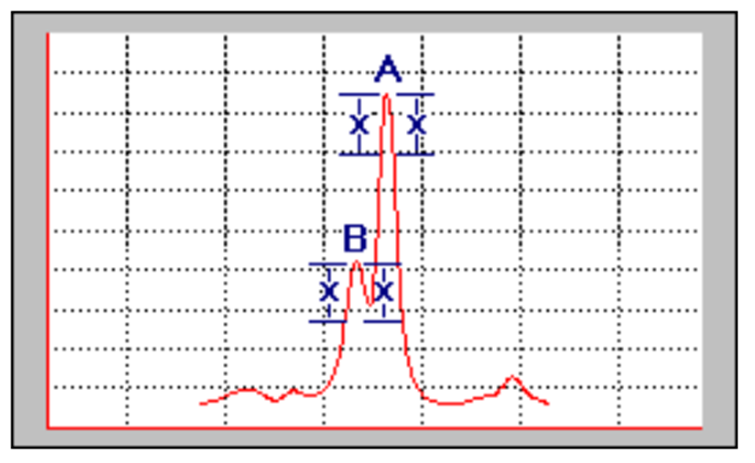
Right-clicking anew on the dataplot and selecting “Peak Labels” will bring up a window for highlighting spectral peaks. The threshold and type of peaks selected can be configured here, as well peak label decimal figures and label positions (under the “Peak Label Details” tab).
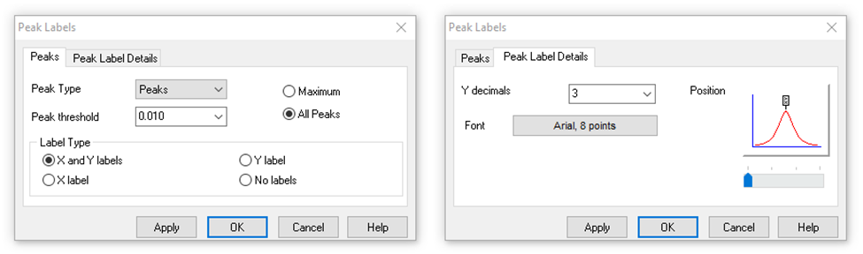
These peak options assume the spectrum is in absorbance units, so to highlight peaks in % transmission and reflection spectra, one would select “Valleys” as the peak type instead. Also of note is the peak threshold value, which is defined as the minimum rise and fall on either side of peaks, as demonstrated by “x’s” in the following diagram.
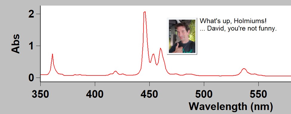
Drawing attention to spectral details using annotations
With basic formatting sorted, let’s take a look at highlighting the most important bits of dataplots. Right-clicking once more on a dataplot and selecting “Add Label” allows adding annotations to the dataplot, as shown below. The coordinates where the user right-clicked are shown in the text field by default, however this can be replaced with any user-entered text.
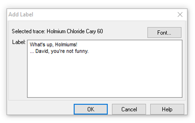
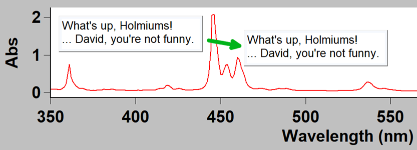
Once the annotation is added, it can be moved around anywhere on the dataplot.
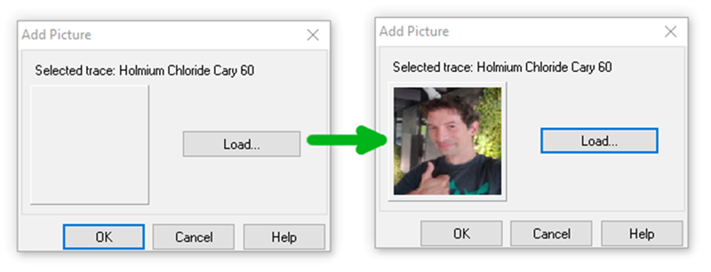
While this is a useful feature by itself, it is even possible to add pictures as annotations to dataplots in similar fashion. This time, selecting “Add Picture” from the right-click menu, any compatible picture file (PNG, JPG, BMP, etc.) can be added to the dataplot. This provides a wide range of possibilities, such as adding before and after photos, corporate logos, symbols, and much more, all directly onto the dataplot.
Now let’s see this in action!
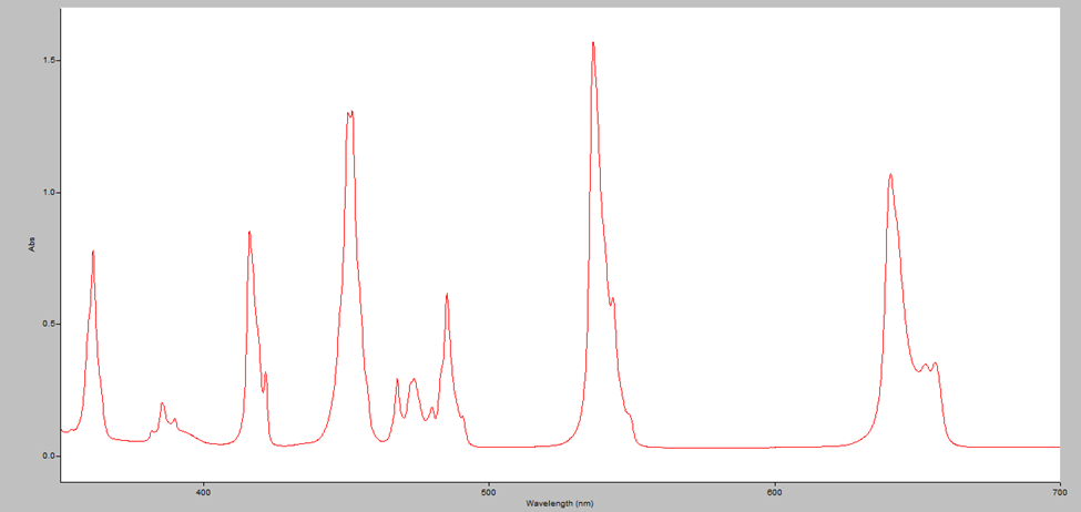
Here’s a quick example showing the drastic improvement in presentation one can achieve using only the tools found within Cary WinUV.
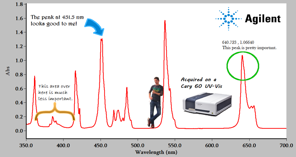
It’s quite amazing what can be done in Cary WinUV without the need to export data and replot it in other software!
Can we copy these beautiful spectra into Powerpoint? Yup!
Our last Cary WinUV trick is a simple, yet immensely useful one. Right-clicking on any dataplot and selecting “Copy Graph” allows copying and pasting said dataplot into any other software which supports image insertion, such as Microsoft Powerpoint/Word, LibreOffice Impress/Writer, Adobe Photoshop, GIMP, etc.
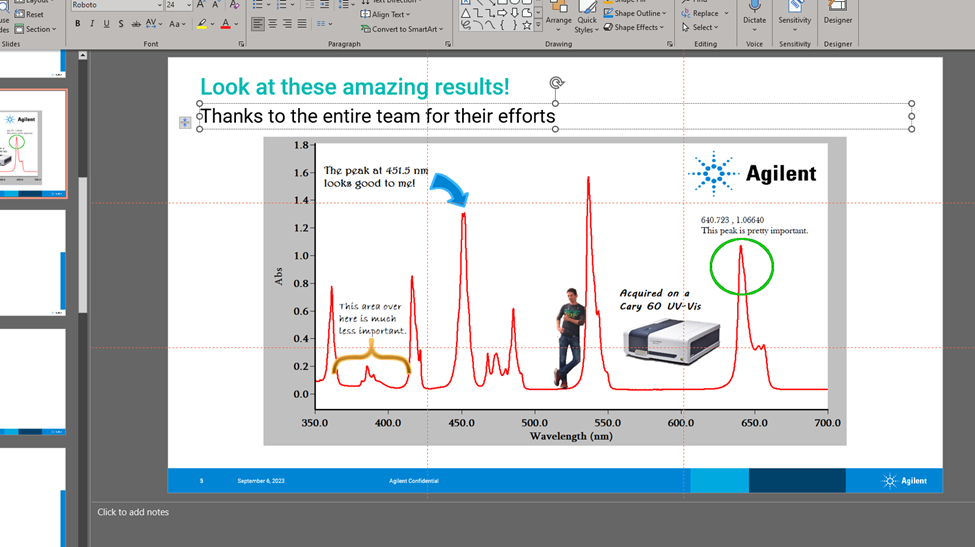
In addition, if multiple dataplots are displayed in Cary WinUV, right-clicking on empty space inbetween and selecting “Copy Graph” will copy all of the graphs as they are shown, thereby saving even more time. Now these data are ready to be presented in all their glory!
Further reading
- Application note: Optical Characterization of Materials Using Spectroscopy
- Technical overview: Cary 60 UV-Vis Spectrophotometer Brochure
- Technical overview: Cary WinUV Software with Spectroscopy Pharma Pack, Compliance with 21 CFR Part 11
Molecular spectroscopy webinar series
Get the latest product information and lots of helpful tips and tricks from our frequent molecular spectroscopy webinars. These live and interactive sessions take place every week, with all previous sessions available to watch on-demand.
Got a question? Leave a note on the comments below or send your query directly to our expert spectroscopy team.
Top Comments